It's a little thing but...
>> Friday, January 30, 2009
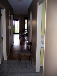
When we moved in, the hall was a bit of a mess. It was painted a dark caramel colour, with a large box flourescent fixture. The doors on the closets were plain slab doors, but one of them only went halfway down, with a curtain tacked on at the bottom. The floors were peeling (and generally aged) vinyl tiles in a faux-marble pattern.
The first thing we did is change the light fixture which has 3 bulbs that create a soft diffused light. We painted the walls in Chalk (which matches the living room walls).
 We changed the doors to bifold wooden slat doors painted Cloud White. We also changed the slab bedroom doors to freshly-painted new panel doors. Finally the floors were updated when we re-did the flooring in the kitchen and bathroom. Which meant also updating the baseboard trim.
I put in a little white bookshelf which creates a little vignette right in the middle - just a spot to put a lamp and plant and make the space cheerful.
 Never underestimate the hallway - you do spend a lot of time there!


14 comments:
Thanks for the inspiration!
I have a deeply neglected hallway to attack.
That after shot looks great. They way you have done it makes the hallway look bigger and lighter. A lot more welcoming. Great job
Beautiful!! I love the way you have decorated the hallway, nice!!
Congratulations!!
Creamy and comforting like vanilla ice cream. Adore the makeover!
Dawn
your home is an inspiration. i can't wait until my house reaches this level of excellence! xx
Very nice makeover! The bookshelf is darling!
What a lovely hallway you have and certainly looks much better than the 'before' one. :-)
everything looks so amazing! good luck selling that house-
:)
Gorgeous! But I wanna see a shot of the embroidery hoop art -- so nice all together in circles.
the hallway looks great. i cannot believe youa re selling after all that work.
amazing how beautiful you have made your house. Great job!
Oh, it's not a little thing...it's huge...all that painting and tiny adjustments (or not so tiny) really makes a difference. It looks very nice.
After all the work to your house - why the heck are you moving??? I can't wait to see how you decorate your new space!
the paint colors you chose are really relaxing; they're warm, but let all of the light into the space. the kitchen tiles look delicious, the cool blue goes nicely with the house. it's kinda bad that you're moving, you can't relax and enjoy all the hard work. it's all really lovely!
Post a Comment